Client: Kelku
Year: 2020
Tags: Brand Identity, Web Design, Corporate, Adobe Illustrator, WordPress
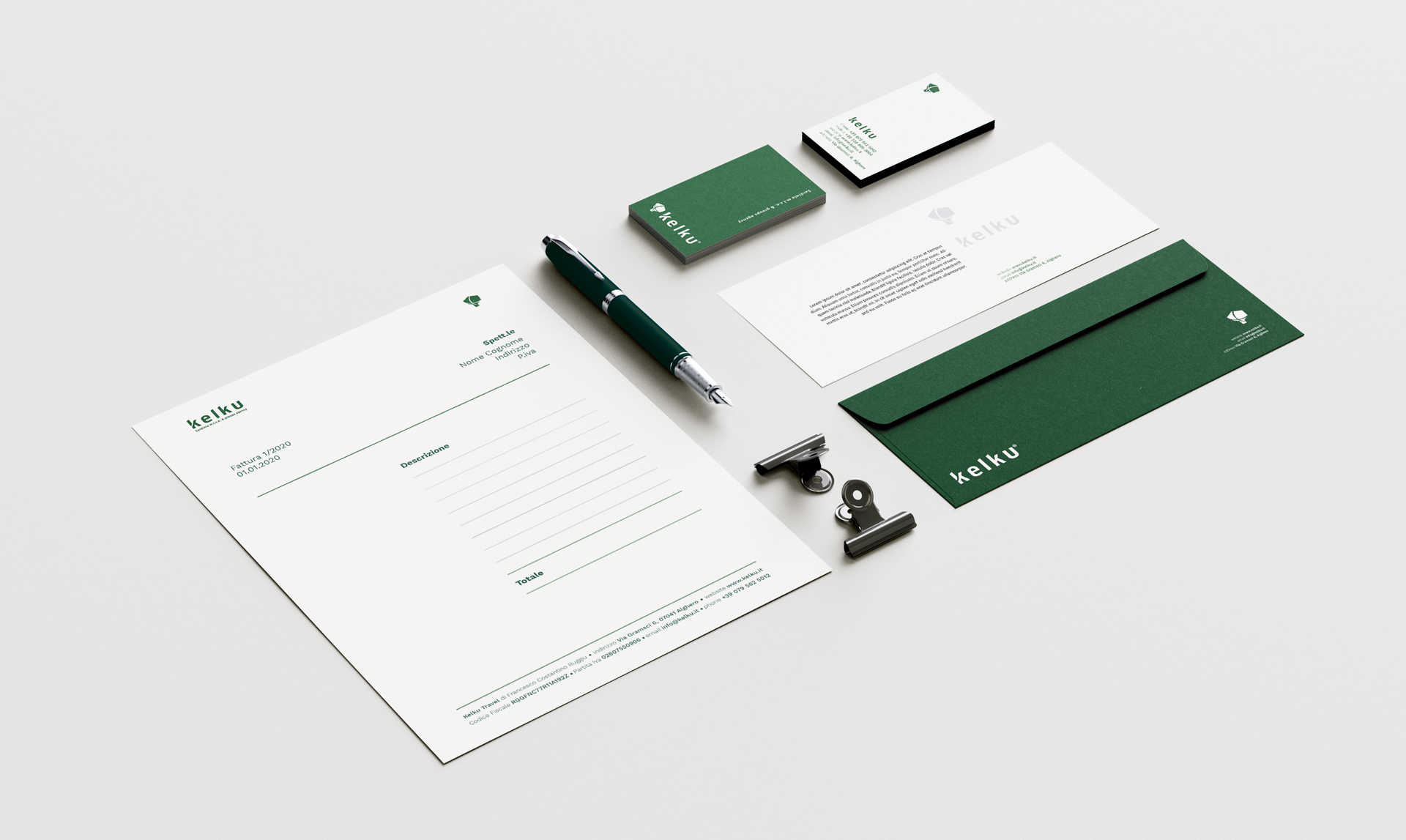
Kelku is a M.I.C.E. & Groups incoming travel agency, based in Sardinia. Kelku offers specialised services in: organisations and management of events, conventions, conferences, meetings, seminaries, incentives, tour and accommodation for groups.
The following were taken care of: naming, texts in Italian and English, logo and the brand identity, company profile and website.
Given the agency’s values and the way it wants to operate, Kelku’s color could only tend towards green. In this case, a greenback that fills the spaces well and gives security.
Intense green
#OD4E29
Shining green
#2AB089
Pure white
#FFFFFF
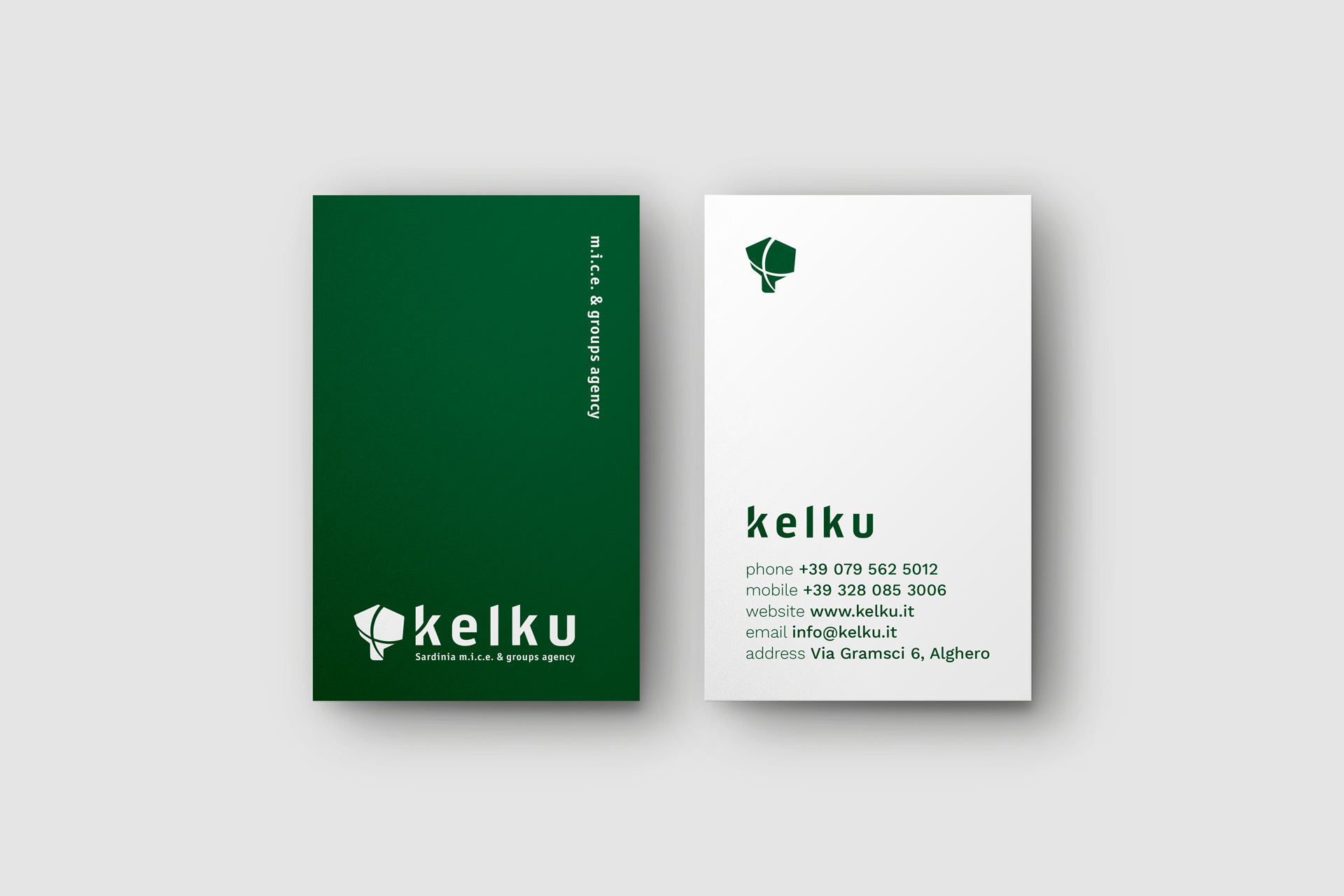
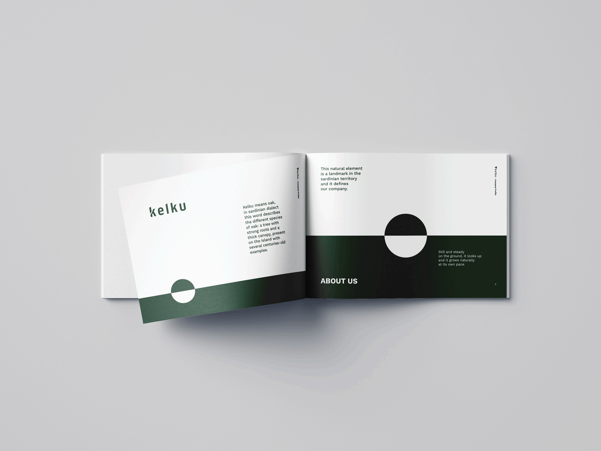
The oak tree, “kelku” in Sardinian, becomes the protagonist, not only in the choice of naming, but also in the design of the brand. The result is an extremely synthesized form, which does not refer directly to the tree icon, but which evokes firmness and movement at the same time. The Kelku oak is therefore not immediately recognizable and does not have simply descriptive features, but hides one of the typical elements of the Sardinian territory through the robustness and safety of the lines.
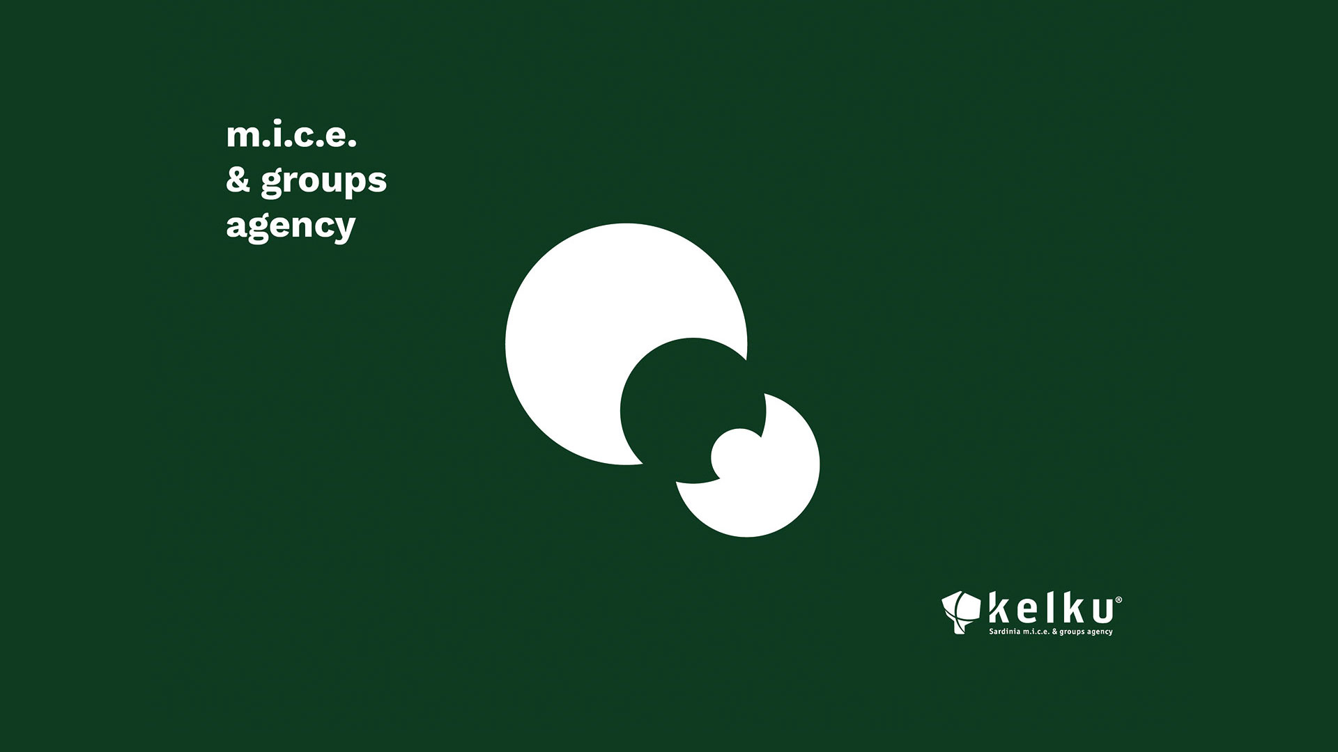
A second element is added to the oak: the wind. This too, synthesized in form and represented by circles with lines of varying thickness, intersects the oak and creates Kelku: the oak moved by the wind.
The process, the doing, the designing and creating of the agency, is therefore represented by the idea of movement: this is the element that allows the brand to be connected to the naming: the “k” of Kelku enters the movement of the wind and unites the parts, making them work together.